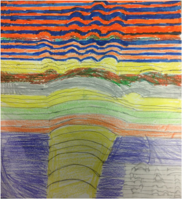
I wanted to make something that looks 3D but is still is on a flat piece of paper. I then thought, what makes things look more 3D? So I first did an alternating complementary color pattern which turned out cool and then I thought if there might be a better way. I then used a mixed crayon and wanted to see if the color affects the look of the hand. Then I wanted to see if the the sections with more of the same color in a row. would be seen the most clearly. I then tried a set of familiar colors so I had a set of colors like a stop light to see if any one catches that it is in the wrong order and if that affects their appeal. then I tried complimentary colors where my hand is one color and my background is different. then I got bored and tried my name in cursive. over all I thought the complementary hand and background looked the best.